

Paul Buckley:
Serendipity
has always played a large role in my decision making on the artists
that I hire. Since I am always working on so many things at any given
time, I walk through life with a constant inner dialog and eyes
scanning all art all the time; and my brain is taking all this in and
wondering if that, or they, might be a good idea for any number of
projects. It has gotten to the point that even going to a museum or
looking through a book of photography, I cannot just look and enjoy it
for the art’s sake... I always see it through the “but can i use it”
filter.

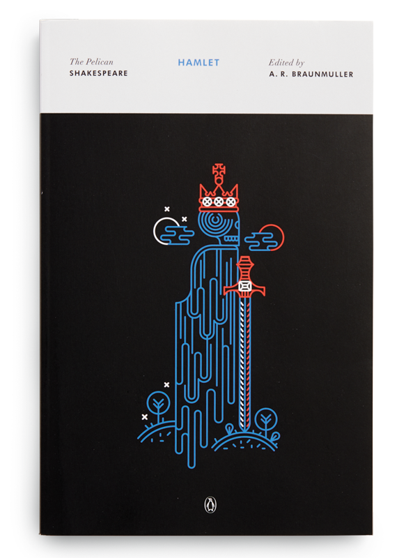
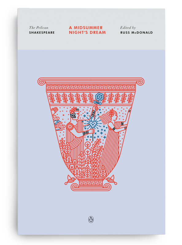
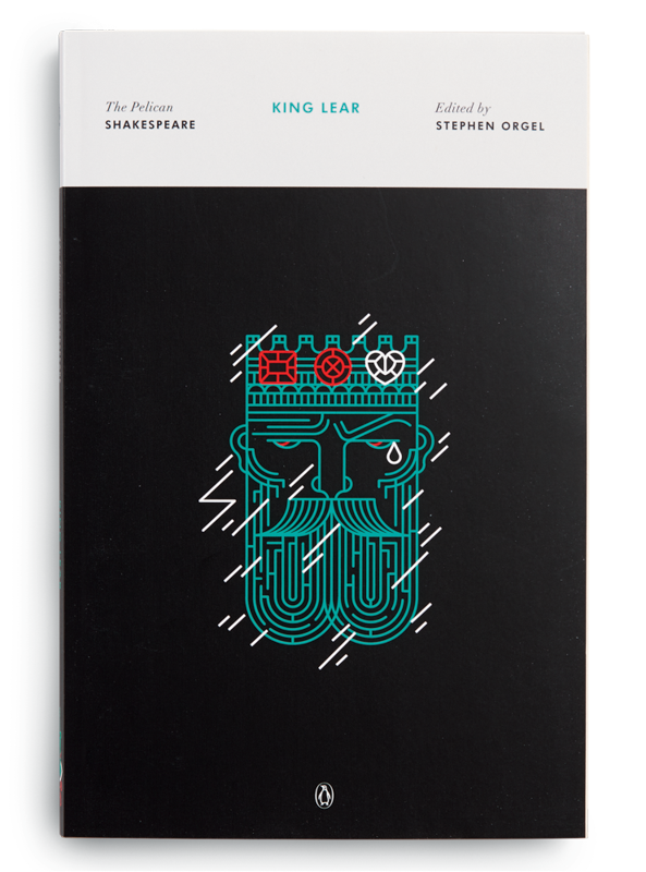
PB: Manuja Waldia was just one of many cold call emails I get every day. I’d never heard of her, but she sent me this very kind email and a few samples and asked me to look at her work, which I did. I had been trying to solve how to package the Shakespeare backlist which is 42 books; an absolutely huge commission with no room for error. Giants such as Milton Glaser and David Gentleman have done these titles in the past and as usual, I wanted to do something different but I was having a hard time figuring out just what that might look like. Manuja’s website was broken into two sections, traditional painting and this very digital vector line work. Upon seeing that linear work, I had my answer... no one has done Shakespeare like this; it’s always a watercolor or some historical art. So I emailed her back and asked this 22 year old who had not yet even graduated, if she’d be up for doing 42 covers for me. I do hope she fell off her chair. So much talent in someone so young, and such a joy to work with—go Manuja!

Manuja Waldia:
Shakespeare’s work is quite old, while my illustration style is very
modern. However, most of the broader themes that appear in the work are
timeless, and it’s genius of Paul to think of using this minimalistic
approach to the cover art for these classics. Previous versions of cover
art for other Shakespeare series were done by Milton Glaser and David
Gentleman, which is intimidating, as those are some very large shoes to
fill. I especially love Gentleman’s because his covers are all woodcuts
that took him more than a decade to finish. Even though my process is a
lot quicker, his patient dedication inspires me to put my best foot
forward for each title.
Being so iconic, every title has many existing artworks, and keeping
these covers fresh is a challenge. While I don’t want to reinvent the
wheel just for the sake of it, I try to think of interesting concepts
and execute the artwork in a unique manner. I strip away all frivolous
plot details and try to condense the most interesting aspects into
artwork made out of very basic shapes. Some titles have a lot of visual
symbolism in the plot, while others have very abstract concepts, which
are harder to translate into artwork. Reading Shakespeare is always
delightful; however, stumbling upon controversial aspects in some of the
titles, like racist slurs and blatant misogyny, is never fun. You know
it’s bad when you’re in favor of the shrew!

The Taming of the Shrew sketch, Manuja Waldia

