
Paul Buckley:
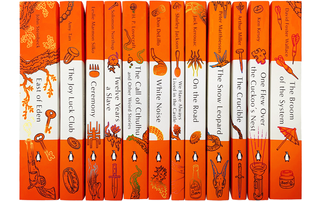
Penguin has a long and rich visual lineage and the now infamous tri-stripe horizontal grid has been in service since 1935, courtesy of Penguin Designer Edward Young. If you google-image the term “Penguin paperback”, 90% of the images are these tri-stripes. I was brought into a meeting where my classics publisher was discussing what fun it might be to do some more contemporary titles in this historic trade-dress. Knowing my words alone would possibly fail to make a sell here, my response was to grab one of the printouts on the table and say yes, but lets bring those panels to life, and have art coming into and out of the dimensions they can afford us—and I quickly drew the image on the following page to illustrate what I was thinking.
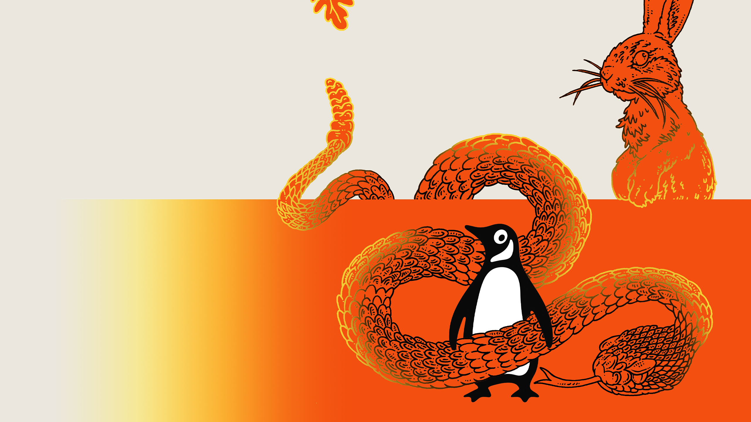
PB: The idea was embraced and I already knew that Eric Nyquist would be my perfect partner on this... I sent him my little sketch and he brought it all wonderfully to life on a series of twelve books. While he was sketching, I updated the classic tri-stripe design to be more modern, while still holding onto it’s recognition factor. My favorite bit was taking the oval our penguin generally resides in, turning it sideways and placing it up top, replacing the wonky lozenge shape that resided up there in the past... a bit of Penguin deconstruction if you may. Also fun was discussing ways we could put the beloved penguin in peril and then seeing folks laugh at the situations we put him into, cauldrons, squid clutches and the like.


Sketches by Eric Nyquist

Eric Nyquist:
The Penguin Classics’ uniform design is a pillar of tradition in the publishing industry. So when Paul Buckley introduced the concept of interweaving my artwork in and around the crisp typography and stately looking orange blocks, I was thrilled. I would be visually assaulting not only the classic design, but the masterful works of Steinbeck, Wallace, Kerouac, and others. Though many of the works, like On The Road, East of Eden, and One Flew Over the Cuckoo’s Nest, have become films, I chose to read each book to harvest imagery from the author’s written words. One week, my wife became a bit curious when she discovered a Post-it on my desk with words like “Bambi’s,” “Vlad the Impaler,” “handcuffs,” and “Brenda the blow up doll” scribbled on it. I explained that they were my notes from David Foster Wallace’s The Broom of the System.


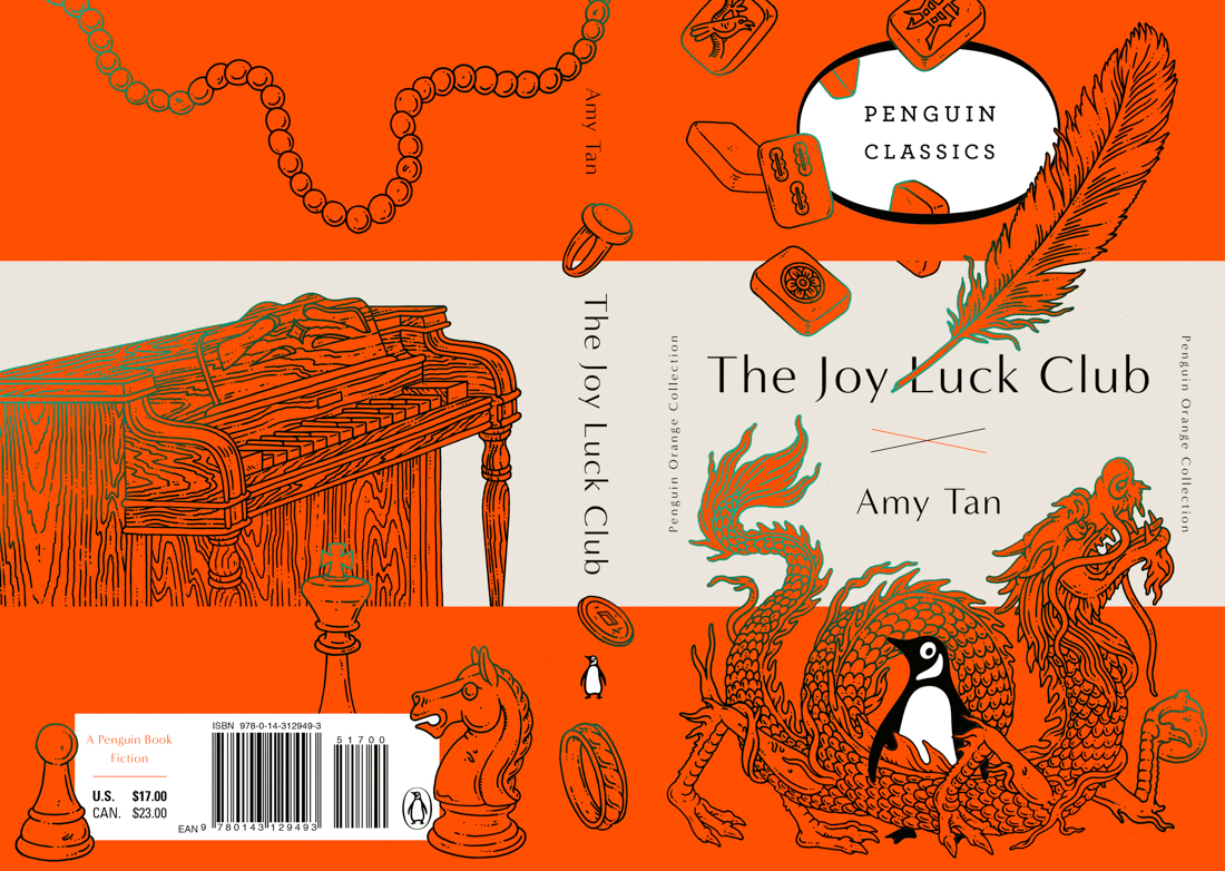
EN: I now look at the Penguin Classics cover differently. Not as a classical flat design, but as a rebellious 3-D landscape that displays the horrific, the absurd, and the taboo. I enjoy the fact that fluorescent splattered, dripping sludge beside a blow-up doll and handcuffs might suggest a storyline of an ’80s porno, but upon further review is actually the remnants of Stonecipheco Corporation baby food (beef flavor) spit out by an unruly infant.