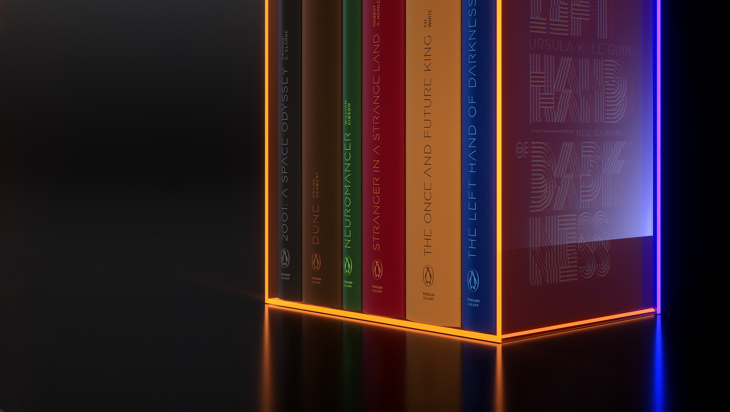
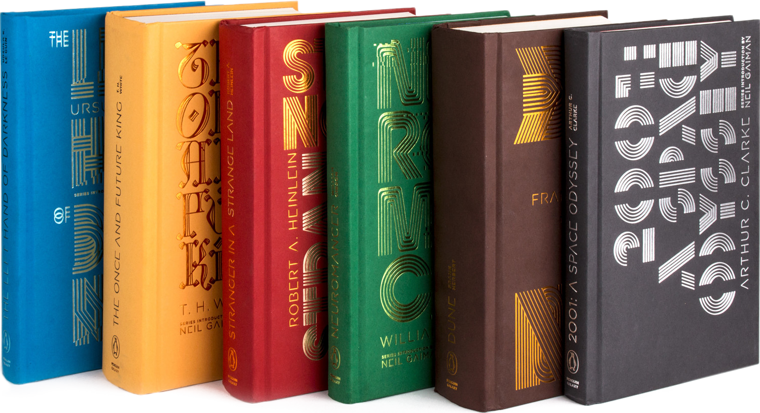
Paul Buckley:
Penguin Classics does not have many “Sci-Fi” titles, and this project was developed to do something about that in a big splashy way. We knew we would put them out as hardcovers. The thing that scares many designers about taking on classics is that they have been packaged so many times before. Many incorrectly think this type of assignment is too boring, I only want to work on new titles. The thing that needs to be understood is that because this material is so well known, so well tread, is exactly that which gives one the freedom to do the material in a way that has never been done before. Sci-Fi writers create these amazing far off, far out, worlds... so an art director’s instinct, a publisher’s instinct, is always lets illustrate this fantastic world, it’s creatures, it’s ships, it’s moons. So what is the exact opposite of all that? ALL TYPE. I have been following the beautiful forward-thinking typographic work of Alex Trochut for years, and it was a very quick decision to put him on this project. Foil on uncoated paper, wrapped over board. I had a few fights pushing these through in-house, but all in all it went fairly smoothly—the biggest argument that just absolutely refused to go away for months was the small issue of the type reading “the wrong way” on the spines. But it’s the future! They do that there!


ALEX TROCHUT:
Dune revolves around Arrakis, a strategic and political key planet in the galaxy, seen from different points of view by different characters playing parts in the events. Dune, as a word, has a unique letter structure that allows you to have the same U shape rotated four times at ninety-degree angles so that it always reads as Dune. This letter puzzle connected well with the idea of Arrakis being such a calculated event in the galaxy. The design ended up being on the back cover because of readability issues. And the front cover focused on a futuristic take on a medieval epic type of mood. Egypt or art deco intersected well with the idea of future and desert.

AT: 2001, A Space Odyssey is a timeless enigma that escapes human understanding. The cover presents another game to us, which forces us to look at things from a different point of view in order to be able to read them. It’s almost an incomplete puzzle, where it seems difficult to be able to complete the reading. The back cover is a previous sequence of this reconstruction, with even fewer pieces to be read. The first sketches were more abstract and pushing readability to the limit, making the game harder for the reader.


AT: William Gibson's Neuromancer made the concept of cyberpunk famous. The world that Neuromancer portrays is chaotic and complex, within a more complex and intricate digital one. The future pictured in the book is not clean or sleek; it’s low key and obscure, mutated into a hybrid of all kinds—cultural, racial, and even man/machine. The glitch was a good way to capture this mix of human and machine, physical and digital, humanizing the machines and mechanizing humans, making a hybrid of both. This is the very first idea.
AT: The process of creating these covers was immersive and playful, and that’s when good things happen—when you turn the project into an addictive game. But let’s be honest, design depends on a collective acceptance and agreement between parts, and is never an act of personal freedom. This dialogue between client and designer in order to find the best way to introduce a product is key in the final result, and the process has to be an exchange of work on both sides so that they can overcome together the limitations that the process will be presenting. Limitations are what creates design. Design is about dealing with them with your own personality and style, but finding a common ground which you establish with your client. I think this series speaks to that, and it was a total privilege to be able to work along with the Penguin team, with these history gems.


