& Paul Buckley
& Marlene De Jesús
& Kristen Haff
Paul Buckley:
I have always been a big Jessica Hische fan... not just the lettering talent, but the whole running a small studio like a business and pursuing your own projects thing; this really impresses me and she helped forge the path that so many now follow—it’s something I talk to students about all the time. I had done a few singular projects with Jessica before and I’m not quite sure why it took me awhile to figure this out, but one day I was looking at her wonderful drop caps on one blog or another and it suddenly hit me, book series. So once again, I go marching upstairs to my classics publisher, Elda, and she immediately says “yes, 26 books!”... I looked happy but confused, so she said “the number of letters in the alphabet... Paul?”... and I said “oh, oh yeah, right”.
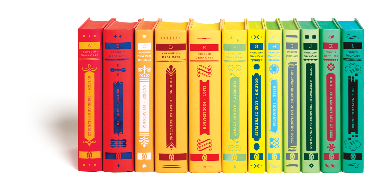
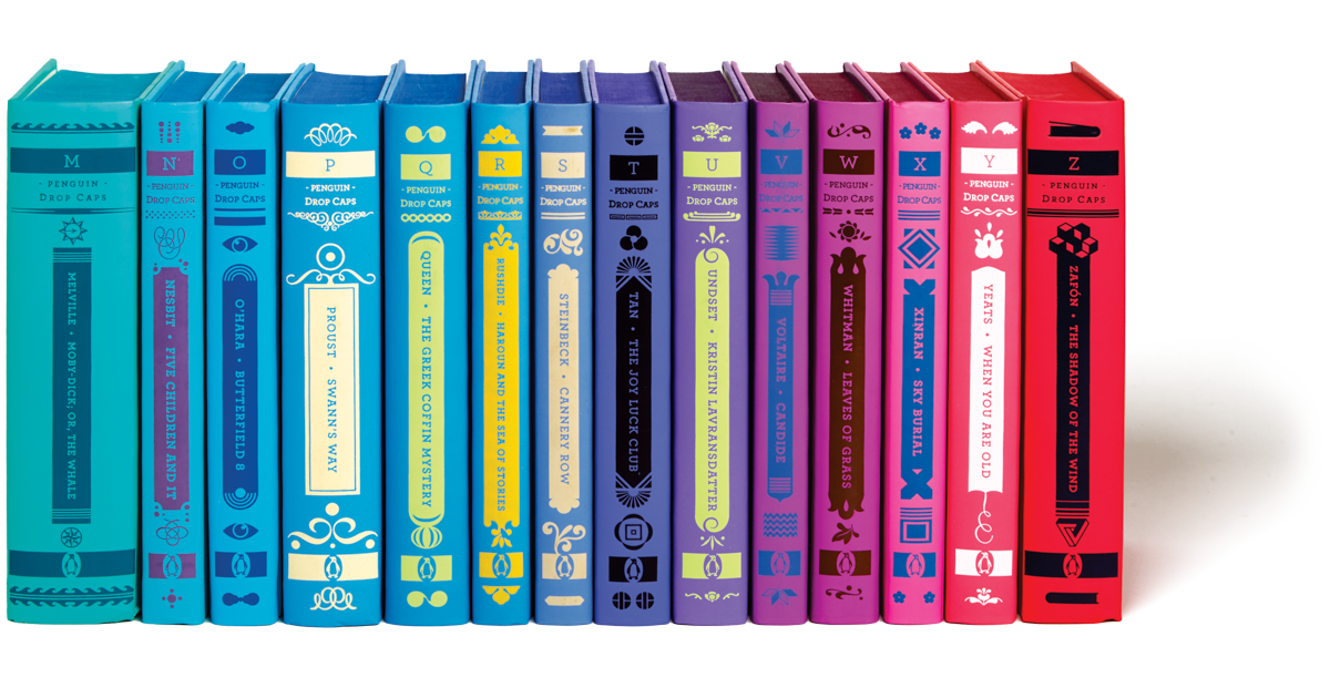
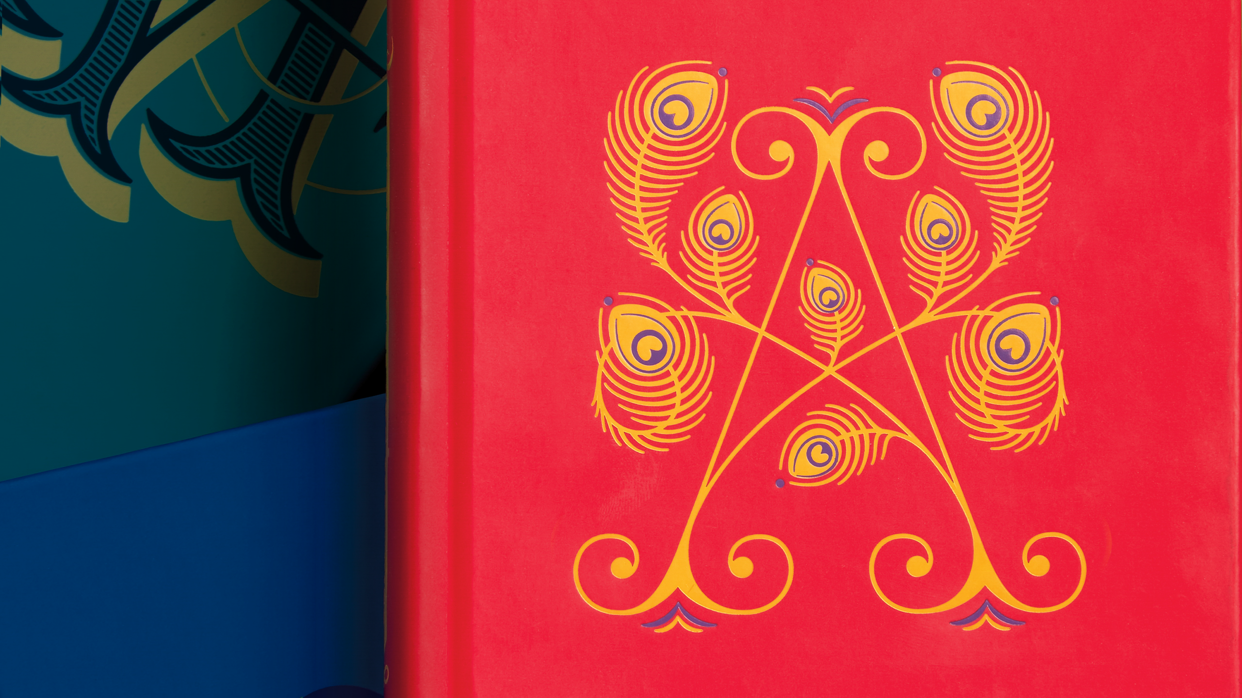
PB: Then I added to this quickly becoming huge project and suggested that we color them into a full spectrum so you gotta buy all 26—and just like that we all became ridiculously busy. Jessica’s role was to provide me with a dual layered drop cap that conceptually played off each title. I then chose two pigmented foil colors for each cap to match wherever we were in the spectrum and designed each spine. It turned out to be an incredibly arduous task as every foil acts differently when stamped onto a color background and no pattern emerged; one blue might have a 50% show-through, while another similar blue might have only 10%; and each roll of foil, even though the manufacturer might state it’s the same chip number, had wildly different characteristics than one made a month prior or after. Maddening, but worth it in the end.

Figuring out foils and color


Brianna Harden & Kristen Haff
both of whom helped me through this series

Press samples

Jessica Hische:
I think the biggest challenge with the Penguin Drop Caps series was trying to not be so literal with the illustration and ornaments. Sure, there were times when it made sense to pluck a more obvious narrative element for the cover (like with Proust—how could we not include the infamous madeleine?), but with other covers, I wanted to allude to mood, tone, setting, etc., in a less obvious way. I’m sure so many people saw these and just assumed we’d appropriated some random Victorian ornamental letter for the cover, but every one was really agonized over and explored. Also, one of the most intimidating things about designing covers for classic books is that you know that many of the readers are already familiar (or really, really obsessed) with the book, so you have to appeal to them as well as all of the new readers coming to the content for the first time.


