Paul Buckley:
With great literature comes great responsibility. I know, I see it, my first line and I’m already a cliché. But I do believe this, or maybe it’s more like I worry about it. And I’m not just talking the you-


How I got here is a long rambling journey that begins with “A long time ago” and finds us here now with “At some point we all decided to have fun with it” and never looked back. Designers are fond of saying that we are only as good as our best clients. This is monumentally true—look at the imprints doing beautiful work. Much of it is attributed to a certain art director or a celebrated designer, or a much-lauded design team. But behind those visual creatives are editorial powerhouses embracing and encouraging that work. For me and my team working on the Classics, Elda Rotor rides up front yelling, “Yes, let’s try this!” followed by John Siciliano and young Sam Raim. They are flanked by the always-fearless Kathryn Court and the unflinching Patrick Nolan. Everyone simply has a good time and lets artists do what they do best: follow their vision. Not a stifler in the bunch.

Due to this brand of open-mindedness, my job is often quite easy. I reach out to an artist I love whose voice matches that of the material in some modern way. I write things like “Please go for it and please have fun.” Maybe that sounds a bit trite—but that’s what I write, because that’s what I want. I want us to laugh, to be shocked, to maybe be a touch worried. I want us all to see the material in a way that we never would have otherwise. If it looks like a familiar classic, start again.
To me the beauty of packaging the Classics is often what others see as the curse—these books, these covers have each been done over a million times, and that is exactly what frees us up to go a bit out of left field with this very well-known material. For a designer and art director, there is no better client, no better material.
It amazes me how very easy it is to be so distinctive with material for which we all have built-in ideas. When Jimi Hendrix played “The Star-Spangled Banner,” it was those two things coming together that made the world stand up and go, “YES.” When you find a mashup that should be so wrong but it just comes out so right, that is what art can do with material you thought you knew.


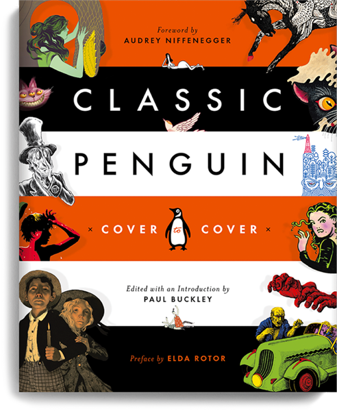
Within these pages the artists and writers involved tell you what it was like for them to dive into this material and with their hands, their minds, give it a new continuity to propel these timeless themes and stories into the world you and I are now occupying. You will see what did not make it onto the covers, rough ideas, outtakes, the excellent and the my-


This book is a celebration of the marriage of beautiful Art & Design and powerful iconic Literature. There will always be ways to experience things anew—the fun is in finding those who want to help you do exactly that.


